Theme properties
Chat Widget Theme Configuration
The chat widget's visual appearance is controlled through a comprehensive theme JSON configuration. Each property in this configuration targets a specific UI element of the chat interface, allowing for complete customization of colors, spacing, and typography.
Theme Structure
The configuration is organized into logical sections that correspond to distinct components of the chat widget:
- Header: Controls the appearance of the chat window's top bar (background color, text style, spacing)
- Launcher: Defines the style of the chat button that initiates the conversation
- MessageBubble: Sets the default formatting for all message bubbles (font size, line spacing, padding)
- MessageList: Determines the styling for the conversation container
- SentMessage: Configures the appearance of user-sent messages, including:
- Standard text messages
- Interactive buttons
- Carousel navigation
- QR codes
- File attachments
- ReceivedMessage: Styles for messages received from the system/agent
- UserInput: Customizes the text input area where users type their messages
- StatusInfo: Controls the appearance of status notifications
- Font: Sets the global font family for the entire widget (NOTE: Non-standard fonts might not render properly to your users)
Each property uses standard CSS values for colors (hex codes), sizes (pixels), and styles. Multiple predefined themes (red, green, blue) are provided as starting points for customization.
Note: Visual references are available in the accompanying images.
{
    header: { // 1
      bg: 'linear-gradient(70.77deg, #6e40ff 38%, #2f8fff)',
      fontSize: '20px',
      text: '#fff',
      padding: '8px',
      logoOnly: true
    },
    launcher: { // 2
      bg: 'linear-gradient(70.77deg, #6e40ff 38%, #2f8fff)'
    },
    messageBubble: { // 3
      fontSize: '14px',
      fontWeight: 300,
      lineHeight: 1.2,
      paddingText: '10px 20px',
      paddingStruct: '20px 20px 15px 20px',
      width: '85%'
    },
    messageList: {
      bg: '#fff' // 4
    },
    sentMessage: { // 5
      wrapperBg: '#fff',
      bg: '#6E40FF',
      text: '#fff',
      button: { // 5a
        bg: '#6E40FF',
        bgHover: 'rgba(110, 64, 255, 0.75)',
        border: 'none',
        text: '#fff',
        textHover: '#fff'
      },
      carouselButton: { //5b
        text: '#6E40FF',
        textHover: '#fff',
        bgHover: '#6E40FF'
      },
      qr: { // 5c
        borderColor: '#6E40FF',
        text: '#6E40FF',
        bgHover: '#6E40FF',
        borderColorHover: '#fff',
        textHover: '#fff'
      },
      file: { // 5d
        bg: 'rgba(110, 64, 255, 0.15)',
        text: '#6E40FF',
        border: '#6E40FF'
      }
    },
    receivedMessage: { // 6
      bg: '#eaeaea',
      marginRight: '25px',
      text: '#222222',
      file: {
        bg: '#eaeaea',
        text: '#222222',
        border: '#222222'
      }
    },
    userInput: { // 7
      wrapperBg: '#fff',
      bg: '#f4f7f9',
      text: '#565867',
      sendIcon: '#6E40FF'
    }
  }
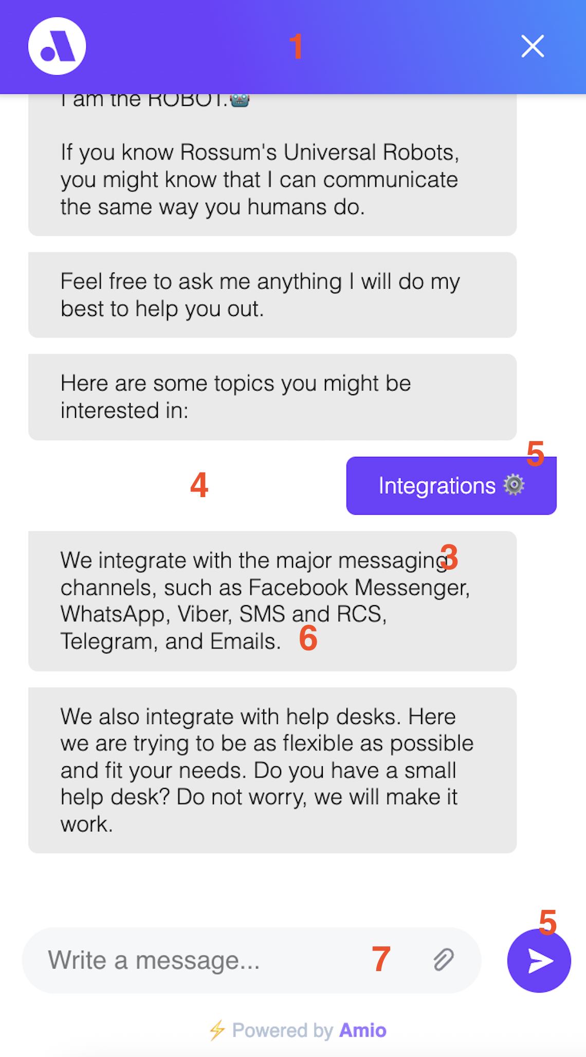
Main chat window
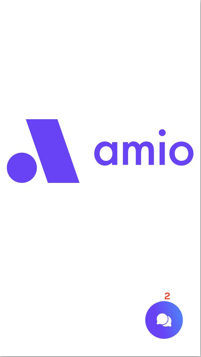
Closed chat icon
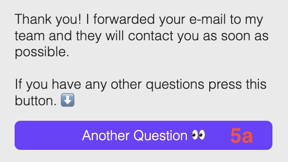
Message with a button
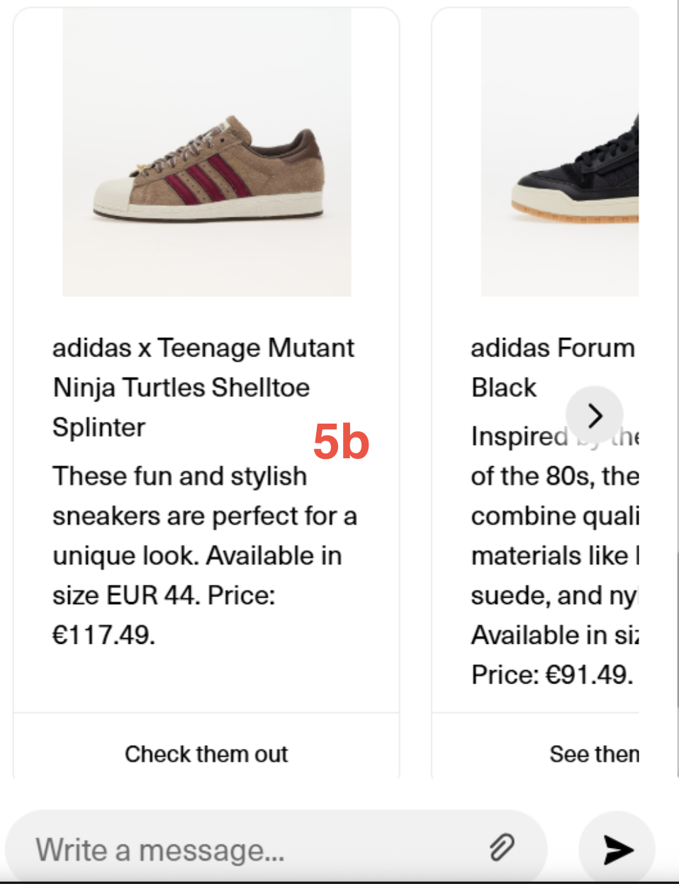
Carousel navigation
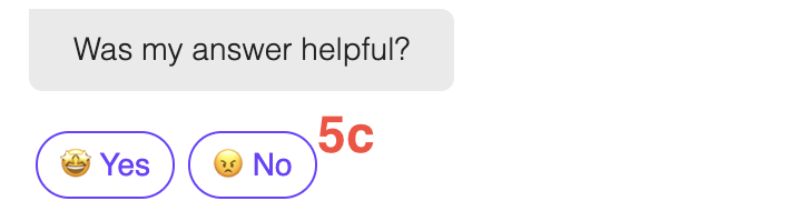
Message with quick replies
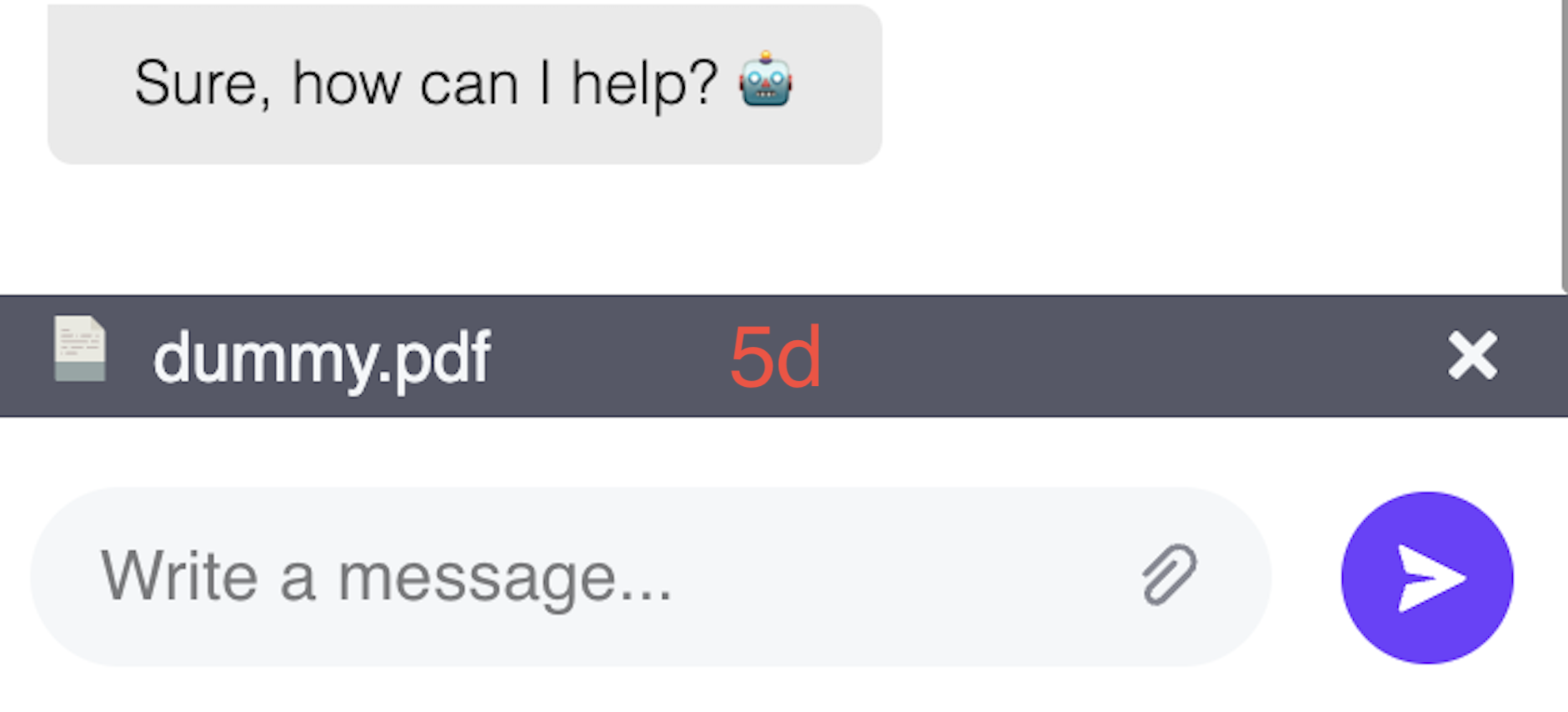
Attached file
Updated over 1 year ago